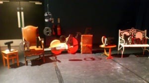
‘They say you should never judge a man before you have walked a mile in his shoes. Almost everything in life is a matter of perspective – affected by context, by experience, by understanding. We should learn to see things from others’ perspectives, to learn, to not be ignorant. This installation highlights the effect of perspective, a visual representation of a social commentary and a matter which we no doubt take for granted, indeed perhaps do not consider not at all, insular beings as we are.’ – Censored Sensibility.
Much of our understanding, opinion, and use of language is effected by matters of perspective. Social, cultural and experiential differences influence the employment of language, and it is worth thinking about this. We are reluctant as a blame-culture, as self-absorbed society, to see things from other people’s perspectives. Selfish and determinted and ever-opinionated, we rarely put ourselves on others’ shoes.
Perspective Mark One:
The original ‘Perspective’ context started life as ‘THE PEN IS MIGHTIER THAN THE SWORDFISH’ – a phrase which sings to our love of language and writing, but a subversion of the the phrase as we understand it. This subversion takes away some of the severity of the phrase and its commentary on the power of language and communication over action and violence. It is also a moment for us to [not] be funny, and to draw in people’s attention. Upon passing the original installation of ‘Perspective’ – placed upon an indoor window by way of ensuring frequent traffic (a veritable marketing ploy) and subtly hinting at the importance of clarity in language use and understanding – the subversion of the phrase causes people to stop and look at it again because it is not what they had quite expected. We have a love of the unusual and an enjoyment of intrigue, and this was an opportunity to draw upon this (as were many of our installations).
Perspective Mark Two:
‘Perspective’ developed alongside the aesthetic and artistic demands of the gallery format (and our own particular style) into a full y-formed installation. The work was originally intended to be a series of 3-dimensional letters which housed a projection of a given phrase to be sketched on, the projection then removed, and the image entirely and clearly visible from a particular position in the room. Demands of time and workload (which, yes, we felt we could easily combat and which we did, though with a struggle – hindsight is a wonderful thing) meant a move to a more simplistic format. 3D letters created, we chose the phrases ‘TAKE CARE’ and ‘BE KIND’ which would be visible from a point in the room. Of different sizes and typographical styles, the letters were arrange on various (a little mismatched) pieces of furniture, which created an eclectic character which we as theatre-makers felt was both appropriate and beautiful.