In an attempt to make our exhibition interactive, without forcing it upon the audience, we introduced a typewriter by the ten day poetry section. The audience was invited to write some of their own poetry or thoughts, and the result was completely beyond what we expected. I wondered if people would exploit the unsupervised medium of a typewriter by using profanities or leaving inappropriate messages, but thankfully this was not the case whatsoever. The poetry people wrote was thought provoking and beautiful, and the post-show feedback regarding the typewriter was overwhelmingly positive. It added a personal mood to the piece, and the way it was sectioned off only helped this.
 Author: Cassie Watson
Emphasis
In keeping with the idea of exposing the subtext of language throughout this exhibition, we did a piece which was affectionately known to us as ’emphasis’.
The idea of this piece was that it allowed the audience to de construct a sentence, and see how the communication of language is just as important as the vocabulary. We created an initial piece on the blackboards within the LPAC,
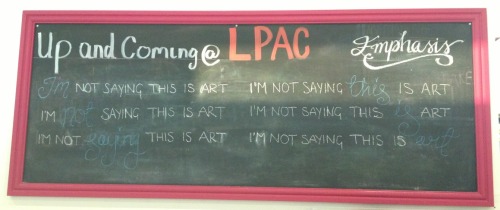
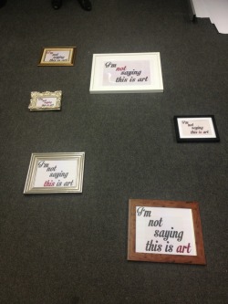
and enjoyed the prototype so much that this phrase became the one used in the final piece. It works because it fits in with our borderline pretentious requirement for all the installations, and gave us a lot of scope in terms of presentation.
This worked out, as our final piece was presented in frames, to create even more subtext. This was easily one of the more simple pieces, : its aesthetic qualities were just as prominent as its meaning, which in my opinion kept the gallery’s atmosphere light.
The Machine
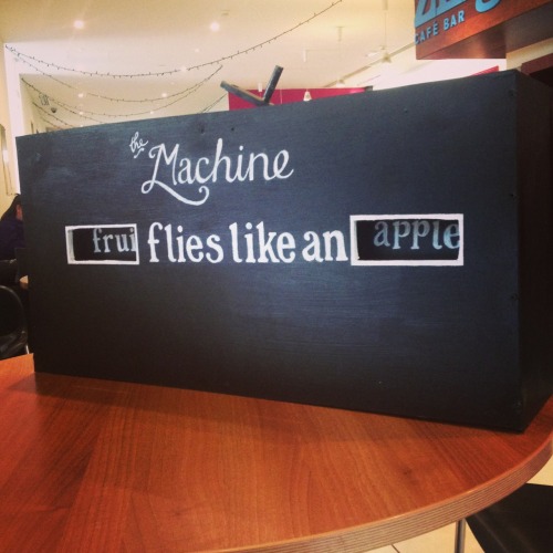
Hopefully in our performance, one thing that really came across clearly was how much work had genuinely gone into the final product, both overall and in each installation. In my opinion, this was never more relevant than in ‘the Machine’.
The Machine did not have any academic inspiration behind it. The Machine came to life when one day Scott and I were talking about interactive elements of performance and how they are great when they are original. Here, the idea of the Machine was born.
There was no initial plan for how it might function, what it might look like, or what it would do, until we decided that its two main components were being visually impressive, and utilising some sort of basic engineering to reinforce a theme within language.
We researched here by looking at phrases, quotes or even other people’s works to see if we could find any starting point in a phrase that is both simple, yet refreshing in its message.
I stumbled upon this:
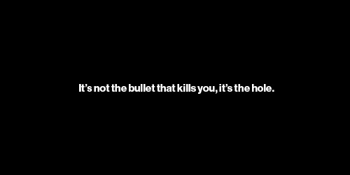
A quote by Laurie Anderson which was a great starting point for letting us see how effective such a short phrase can be to give you a new perspective. This let us realise that the machine could be used to take an ordinary phrase, and distort until it forces the audience to see it in a new light.
After hearing about the phrase ‘time flies like an arrow, fruit flies like a banana,” and its ability to confuse artificial intelligence, I read further into it:
“The sentence, “Time flies like an arrow,” was interpreted by a computer as meaning ‘A certain kind of a fly, called a ‘time’ fly, has a liking for arrows.’ This may seem like a unusually silly interpretation, but the same interpretation is perfectly all right in a sentence such as “Fruit flies like a banana,” because fruit flies are a certain category of fly that have a liking for bananas. So the difficulty was not that the computer constructed a totally implausible interpretation of the sentence, but rather, that it did not have enough contextual knowledge to resolve the genuine ambiguities in the sentence. Ambiguities abound in ordinary language. When human beings have the right contextual knowledge, we resolve such ambiguities very quickly. But without context, we encounter the same difficulties that hobbled the early computer models of language comprehension.” (The Cognitive Revolution in Psychology)
This was perfect, as its culturally relevant, and fit into our ideals: playful, simple and got our point across without making it didactic.
The machine was then underway. Initial sketches looked like this:
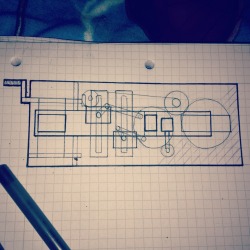
but upon realising we had no experience, tools, or space in which to build this, the machine became more simple as time went on.
Ultimately, it ended up looking as we’d hoped, and was a hit in the performance.
Works Cited:
Bernard J. Baars, The Cognitive Revolution in Psychology, (London: Guildford Press, 1986) p.167.
The Space!
The space of the piece is something that initially worried us. Studio one and two were repeatedly suggested to us because they made a good space for a gallery style performance, but we were adamant for the auditorium. This was originally because we enjoyed how the space felt: it’s used for more ‘official’ performances, and has proper seating and a more general theatre feel.
As the performance became more solid, so did our understanding of the space and its relation. We knew we wanted to use the whole room, with the chairs down, and had no fears that the size of the room would overwhelm the few installations we had planned. In becoming more aware of what our performance was going to consist of, it allowed us to build up a relationship between the space and the performance.
We knew that we wanted the installations to be linked to each other, be it with a narrative or some sort of physical path. It was in our reaearch that we found inspiration for the final idea:

(http://www.lostateminor.com/2011/02/10/labryinth-made-entirely-out-from-salt/) this piece by Motoi Yamamato used the salt’s Japanese “symbol of purification and mourning, and he started sketching with salt to honour his sister’s passing from brain cancer”. This deep association struck a chord with us, and we adored the aesthetics of the piece, especially the way it is clear to see how much effort has gone into the presentation.
From this we decided to create our own salt path: this helped reinforce our theme of black and white. It also assisted the message behind ‘Have a Nice Day’, being an interactive and live action version of these lines that started out crisp and white and got more and more messy as the day went on and the audience became less and less concerned with keeping in the lines.
The actual pattern of the salt lines took longer to think of. We ended up positioning each installation at a point in a giant ampersand, with an outline in which the audience was supposed to stay. Above this ampersand and outside of the public area was the word ‘trial’, and below was the word ‘error’. This was a technique that also reinforced the ‘Perspective’ part of our gallery, in that the audience was invited to go up to the balcony floor upon leaving the gallery, to get a birds eye view of the salt lines and the exhibition in general.
Having had no time to view the auditorium since the first few weeks of the module, when the day of performance approached, we were apprehensive to set up. This is because we didn’t feel like we had a complete awareness or plan of where everything would go in the space, but as one of our (heavily relied upon) mottos stated; ‘nothing we do is an exact science’. We recognised that it it perhaps wouldn’t go to plan, but having had problems with every installation so far, and finding that it usually improved upon them, we weren’t phased. The space ended up being one of the biggest contributers to the atmosphere created by the gallery, and the way that it wasn’t centralised to any particular point fit in with our idea of letting people choose to interpret or approach things however they felt most appropriate.
First Thoughts – CW: Ideas About The Piece
I want to get across in our piece the power of words. Not necessarily go on some endless verbal manifesto about how if we listen to the poetry our heart creates that we can brave a thousand storms or nonsensical bollocks like that but rather get across the genuine power of words.
Swear words, combinations of letters, are banned from television before a certain time. ‘Cunt’ is deemed to be one of the worst insults in our language.
Sometimes I wonder if I disagree with swearing, I wonder if it makes you vulgar or uneducated. But then I think about it, and that’s not true at all. I like that we have designated words for when we have this burst of passion- positive or negative- and all we can use to express them is man made clusters of vowels and consonants. ‘Fuck’ is possibly the best word in our language- with so many variations and meanings that essentially boil down to that same resounding idea of passion, I’m only grateful for it. Let it be banned before 9 o’ clock. Let it be owned by grown ups and very daring children.
It’s not just singular words that have this impact either though. I’ve always wondered why it’s so much easier to remember an insult than a compliment, and I think it’s because compliments are always sovague.If someone said ‘you look bad today’, or ‘your hair looks bad’ , it lacks a lot of care and conviction, I think I could brush that off pretty easy. Insults are made to hurt you in a way that compliments aren’t made to fix you. Insults choose something specific, and we always care more about specific things. Try complimenting someone specifically, and I bet you it’ll stay with them. It disarms them. It’s wonderful.
CW.