Statistics – Worst Words

Something which, in our study and consideration of language, strikes us as an interesting point, is the value (or lack of value) we place on some words, and indeed the positive (and negative) attitudes we have towards some words. Some words are less enjoyed, or are indeed abhorred; profanities, for example – think, ‘everyone’ has the same most hated – are just a series of letters as much as any other word, but our valuation of the word, proportional, it seems, to our use of it, has made it so much more severe. Stephen Fry provides some ridicule of the Watershed by noting that in everyday life we (rather overdramatically) place negative terms where they are not best used – ‘the traffic was murder this morning’, ‘this lecture is torture’, ‘the highstreet is dead today’ – and do not see the nonsense in this. Morover, we don’t feel any need for censorship in this – but, wait, we are talking about death, torture, murder, so… What’s more, Fry notes that even in doing this, we feel the need to wait until the dark of night to say, for example, ‘fuck’ (in a sexual context or otherwise) when the use of this and its brothers expresses genuine passion and intensity. How can we censor passion but not the thoughtless use of serious terms?

Statistics Mark One:

Thinking from here about the nature of potentially destructive language, and having discussed our favourite words and, perhaps more reluctantly, our hated ones, we considered language somewhat in relation to identity, asking the

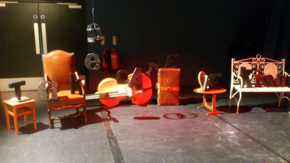
question ‘What is the Worst Word someone could use to describe you?’ Setting out a black box (calling to our aesthetic desires and designs, as ever – something referred to as ‘the insistence on the image’ in Theatre of Images Revisited by Klich and Scheer) we allowed people to write that which they consider to be the worst description someone could use for them and place it in the box. 107 responses came, bravely, from our peers adnwe chose to categorise them in order to move towards a format through which we could represent the statistics. Arguably, it would have been better to allow a cross-section of our peers to categorise the results themselves because they would then be reflecting on their contribution, rather than we as theatre-makers ma

nipulating something which we were only facilitating. Regardless of this, though, the piece – particularly the categorisation – was rather insightful.


Statistics Mark Two:

Stats
St&tistics – Worst Words

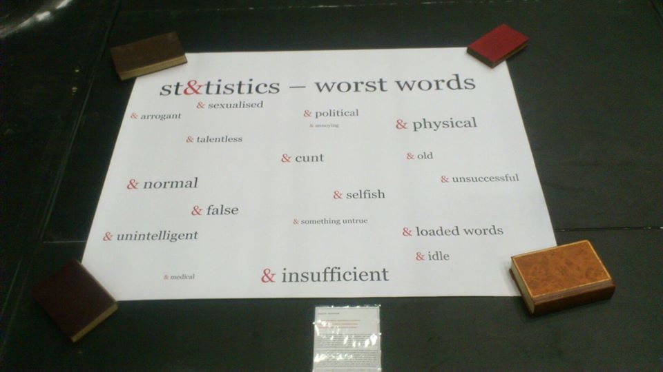
From the collection of the data we experimented with various ways of representing the statistics – perhaps a slightly crude way of considering people’s feelings about these words (and, by extension, themselves) but arguably all the more effective because the coldness of statistical representation is in such sharp contrast with the deeper meanings that the critique and message of the piece is all the more significant. Taking inspiration from visual representations of rape statistics which I came across via Tumblr (and which can be seen in original location here – http://www.circlesoffireproductions.com/2013/01/the-facts-about-rape-are-bad-enough/) I began to experiment with various ways to achieve the end goal – an attractive and clear presentation of the information which was still unusual enough to fit with the character of our piece. Our final presentation – red and black against a stark white background, and with ‘&’ as a frequent image (all of which is a continuous thread in Censored Sensibility) came together clearly and visually attractively, yet another contrast to the negativity of the work’s implications.


Statistics Mark Two-Point-Oh-No-Actually-Never-Mind:

After the collation of the first sets of data, we changed our box to read ‘What is your favourite word?’ While this was an interesting task and one which received many responses, to change to a positive idea, we felt, decreased the value of the first ‘Worst Word’ idea. An exploration of positive language tells us less about ourselves and our use of language and does not have the critical edge which we very much desired and which features in all of our installations. Perhaps a shame to waste it, but we feel it was better left alone. Nothing we do is an exact science, everything is Trial & Error, and if you don’t try you’ll never know.

The Space!

The space of the piece is something that initially worried us. Studio one and two were repeatedly suggested to us because they made a good space for a gallery style performance, but we were adamant for the auditorium. This was originally because we enjoyed how the space felt: it’s used for more ‘official’ performances, and has proper seating and a more general theatre feel.

As the performance became more solid, so did our understanding of the space and its relation. We knew we wanted to use the whole room, with the chairs down, and had no fears that the size of the room would overwhelm the few installations we had planned. In becoming more aware of what our performance was going to consist of, it allowed us to build up a relationship between the space and the performance.

We knew that we wanted the installations to be linked to each other, be it with a narrative or some sort of physical path. It was in our reaearch that we found inspiration for the final idea:

Labryinth made entirely from salt

(http://www.lostateminor.com/2011/02/10/labryinth-made-entirely-out-from-salt/) this piece by Motoi Yamamato used the salt’s Japanese “symbol of purification and mourning, and he started sketching with salt to honour his sister’s passing from brain cancer”. This deep association struck a chord with us, and we adored the aesthetics of the piece, especially the way it is clear to see how much effort has gone into the presentation.

From this we decided to create our own salt path: this helped reinforce our theme of black and white. It also assisted the message behind ‘Have a Nice Day’, being an interactive and live action version of  these lines that started out crisp and white and got more and more messy as the day went on and the audience became less and less concerned with keeping in the lines.

The actual pattern of the salt lines took longer to think of. We ended up positioning each installation at a point in a giant ampersand, with an outline in which the audience was supposed to stay. Above this ampersand and outside of the public area was the word ‘trial’, and below was the word ‘error’. This was a technique that also reinforced the ‘Perspective’ part of our gallery, in that the audience was invited to go up to the balcony floor upon leaving the gallery, to get a birds eye view of the salt lines and the exhibition in general.

Having had no time to view the auditorium since the first few weeks of the module, when the day of performance approached, we were apprehensive to set up. This is because we didn’t feel like we had a complete awareness or plan of where everything would go in the space, but as one of our (heavily relied upon) mottos stated; ‘nothing we do is an exact science’. We recognised that it it perhaps wouldn’t go to plan, but having had problems with every installation so far, and finding that it usually improved upon them, we weren’t phased. The space ended up being one of the biggest contributers to the atmosphere created by the gallery, and the way that it wasn’t centralised to any particular point fit in with our idea of letting people choose to interpret or approach things however they felt most appropriate.

Perspective

‘They say you should never judge a man before you have walked a mile in his shoes. Almost everything in life is a matter of perspective – affected by context, by experience, by understanding. We should learn to see things from others’ perspectives, to learn, to not be ignorant. This installation highlights the effect of perspective, a visual representation of a social commentary and a matter which we no doubt take for granted, indeed perhaps do not consider not at all, insular beings as we are.’ – Censored Sensibility.


Much of our understanding, opinion, and use of language is effected by matters of perspective. Social, cultural and experiential differences influence the employment of language, and it is worth thinking about this. We are reluctant as a blame-culture, as self-absorbed society, to see things from other people’s perspectives. Selfish and determinted and ever-opinionated, we rarely put ourselves on others’ shoes.


Perspective Mark One:

The original ‘Perspective’ context started life as ‘THE PEN IS MIGHTIER THAN THE SWORDFISH’ – a phrase which sings to our love of language and writing, but a subversion of the the phrase as we understand it. This subversion takes away some of the severity of the phrase and its commentary on the power of language and communication over action and violence. It is also a moment for us to [not] be funny, and to draw in people’s attention. Upon passing the original installation of ‘Perspective’ – placed upon an indoor window by way of ensuring frequent traffic (a veritable marketing ploy) and subtly hinting at the importance of clarity in language use and understanding – the subversion of the phrase causes people to stop and look at it again because it is not what they had quite expected. We have a love of the unusual and an enjoyment of intrigue, and this was an opportunity to draw upon this (as were many of our installations).

Perspective Mark Two:

‘Perspective’ developed alongside the aesthetic and artistic demands of the gallery format (and our own particular style) into a fullPerspectivey-formed installation. The work was originally intended to be a series of 3-dimensional letters which housed a projection of a given phrase to be sketched on, the projection then removed, and the image entirely and clearly visible from a particular position in the room. Demands of time and workload (which, yes, we felt we could easily combat and which we did, though with a struggle – hindsight is a wonderful thing) meant a move to a more simplistic format. 3D letters created, we chose the phrases ‘TAKE CARE’ and ‘BE KIND’ which would be visible from a point in the room. Of different sizes and typographical styles, the letters were arrange on various (a little mismatched) pieces of furniture, which created an eclectic character which we as theatre-makers felt was both appropriate and beautiful.

Degradation – Have a Nice Day

Degradation Mark One:

Considering the implications of positive and negative words/messages, alongside the value of aesthetics, Censored Sensibility spent two hours writing out the message ‘HAVE A NICE DAY’ in detailed and attractive font. The time it took to create and the length of time it remained reflects our whole piece – durational, gallery-like, installation-based – effectively and proved an encouraging place to start. Placed in a thoroughfare area of the LPAC, the piece became known as ‘Degredation’, and our primary concern: will people be precious about stepping upon a work of art, and one that has a positive message? or will the work degrade, with passers-by not considering their effect on the work?

Degredation - an experiment.
Degredation – an experiment.

It was well-noted that we had spent a considerable amount of time working on creating the piece, so the breakdown of the work was interesting to see. People’s concern is showing disrespect to the piece while it is still being worked upon, or while its artists are still present. However, given the steady Degredation of the work over a week and a half shows that this concern does not translate to the every day. It proved interesting to see the gradual change and, given that Censored Sensibility is largely concerned with the power of language, that a positive message does not necessarily encourage great thoughfulness.


Degradation Mark Two:

Large-scale re-formats seem to be something about which we’re quite keen, but perhaps Mark Two was a step further than necessary. A durational and large-scale recording of ‘HAVE A NICE DAY’ was taken in the outside courtyard of the LPAC, our second home and a place of frequent people traffic. Though a good opportunith, it did not experience enough degradation to truly and effectively represent the message and implications of the installation. Loss of a memory card may have been a blessing in disguise, because we moved back to a simpler and more effective format.

Degradation Mark Three (or, Mark One Revisited):

Returning to our original format, ‘HAVE A NICE DAY’ became a gradually degrading chalk message of which pictures were taken to document its breakdown. These images were compiled into a presentation which was projected in the Censored Sensibility  gallery and in front of which people were invited to sit and look at the degradation of the piece. As theatre-makers it is important to be flexible, open, and creative. Nothing we do is an exact science, and not everything will go perfectly to plan. We felt this here and in every installation (none were without their problems) but it was certainly worth it for every moment of learning, every opportunity (or, arguably, need) for new ideas, and as a test (and therefore testament) to our commitment to the work, something which we feel certainly came across.


SM.